In this workshop, you're going to make a colorful spinning wheel with your own custom content, in 20 minutes!
Here's the live demo and the final code.
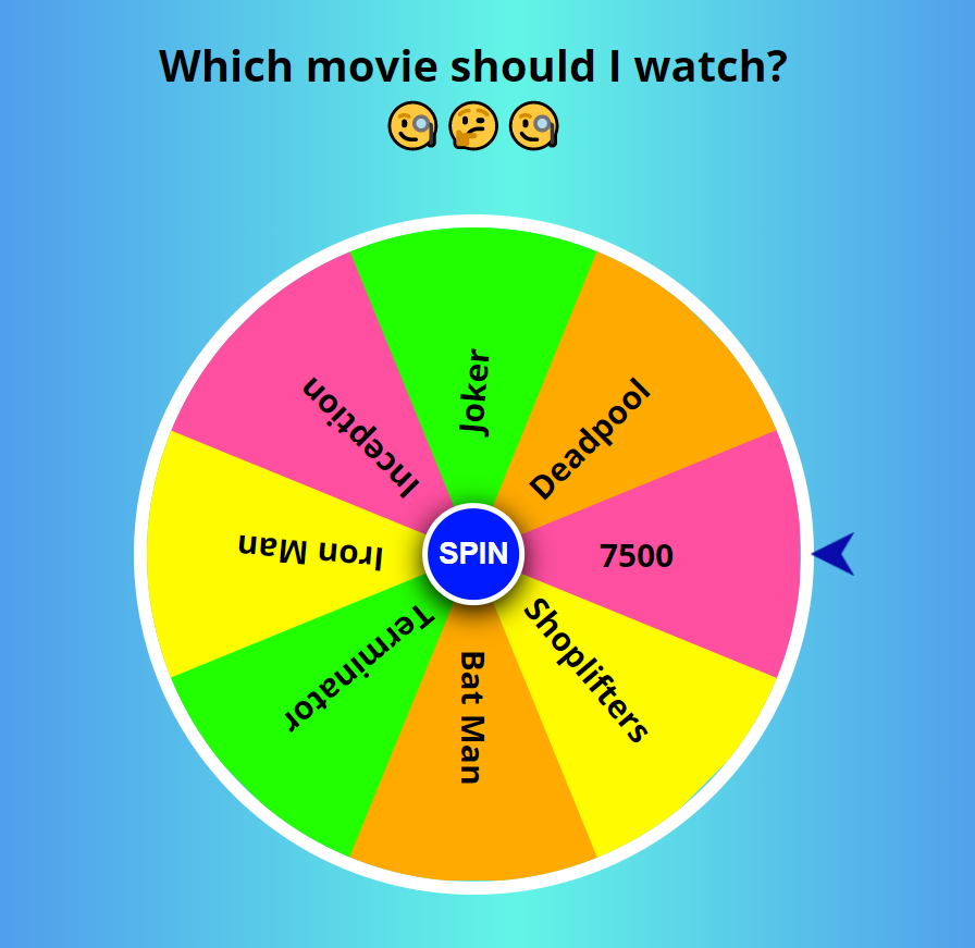
^^^ If you will follow this workshop strictly then you will make something like the above picture, but feel free to add up your imaginations with patterns and colors and you will end up with something better than this. So let's begin. 😁✨
Part 1: Prerequisites
- Account on Repl.it
- Basic knowledge of HTML, CSS and JavaScript would be helpful but is not necessary to continue further.
Part 2: Setup
Setting up our code environment
In this workshop, we'll be using repl.it, a free, online code editor.
You can get started with it by going to repl.it/languages/html. You will directly land on the page where we can write our code.
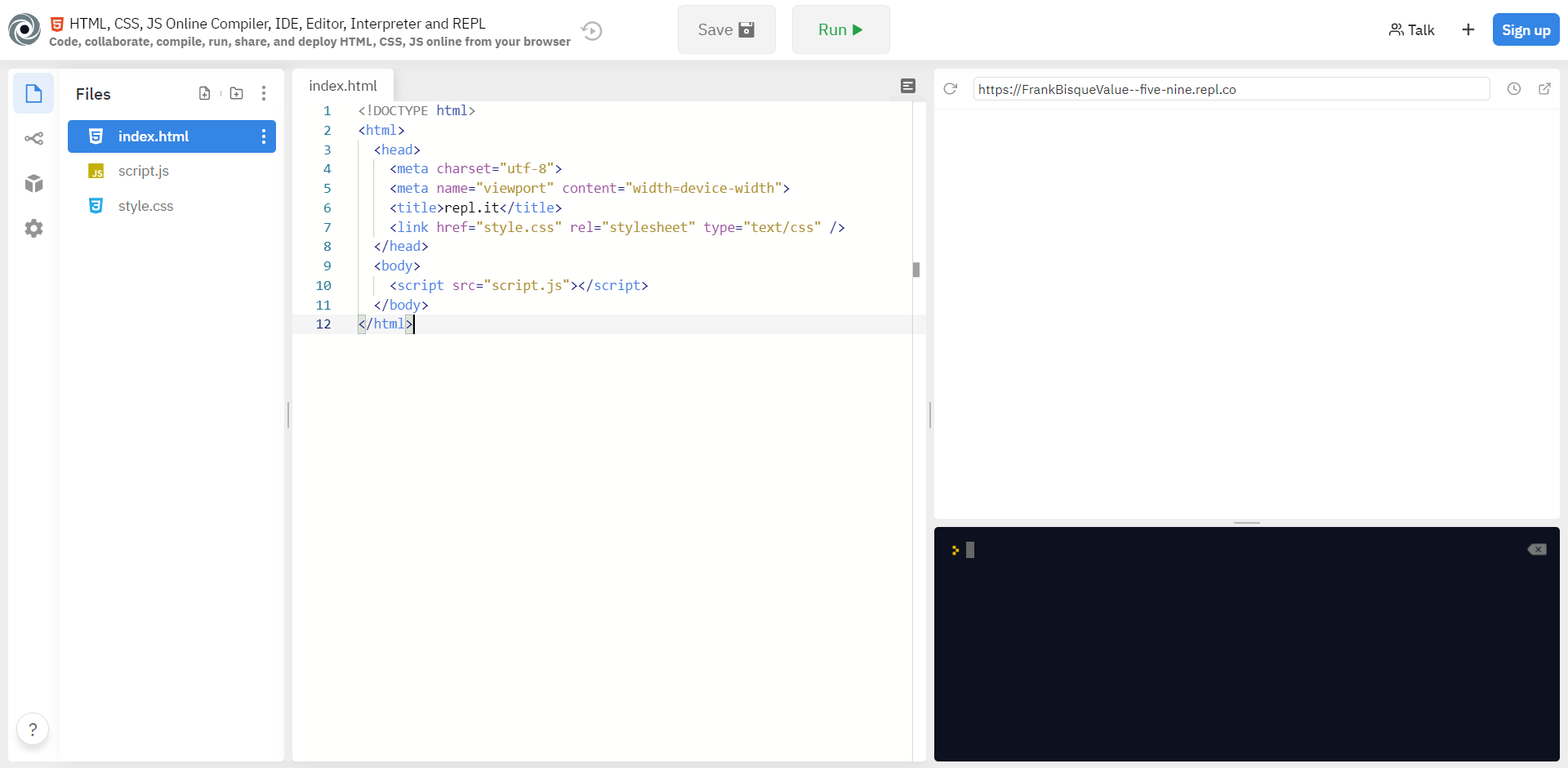
^ Right now your page will look like this.
Part 3: Inspecting The Default Files
Here on the left side in the files section, you can see 3 files that are:
- index.html
- script.js
- style.css
Now let’s take a look at those and try to understand it individually.
1) The HTML file
HTML gives the structure to our webpage. Here in the first line, we have <!DOCTYPE html> which is used for specifying the version of HTML the document is using. Next, we have the <title> tag which specifies the title of our webpage that will be shown on the tab bar. Then we have <body> tag which contains the main visible part of our web page. Make sure that all the code you write is included between the opening and closing tags. ( <body></body> )
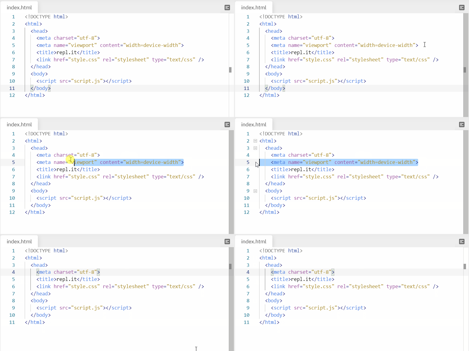
Make sure to remove line 5 (<meta name="viewport" content="width=device-width">) which may cause some weird responsiveness issues for our workshop.
2) The CSS file
This is the style.css file in your directory. This defines the looks of our website. Whatever styles we give to our website is written in this file. If you take a look in the <head> tag in your HTML file, you will find a line of code (<link href="style.css" rel="stylesheet" type="text/css" />). This means that your HTML file is properly linked to your CSS file!
3) The JavaScript file
This is the script.js file in your directory. It's empty for now, but we will fill it eventually through the workshop! The code written here will be responsible for the functioning of our wheel. If you take a look in the <body> tag in your HTML file, you will find a line of code (<script src="script.js"></script>). This means that your HTML file is properly linked to your JavaScript file!
Part 4: Building the Wheel
1) HTML
Let’s begin the coding part of our workshop. Here we will write the HTML code required to build our wheel.
Make a new section with the assistance of <div> tag inside your body labels (<body> </body>).
Add the attributes id="mainbox" and class="mainbox" inside that segment. Adding id and class attributes gives this particular div its own "name", which will allow us to reference it directly using CSS and JavaScript (as we'll see later in this workshop!).
<div id="mainbox" class="mainbox"></div>
Next, create another div with id="box" and class="box". Nest this inside the mainbox div, like so:
<div id="mainbox" class="mainbox">
  <div id="box" class="box">

  </div>
</div>
Nested inside the box div, create another div with the class box1. Then, inside that, add 4 span tags, like so:
<div id="mainbox" class="mainbox">
  <div id="box" class="box">
    <div class="box1">
      <span class="span1"></span>
      <span class="span2"></span>
      <span class="span3"></span>
      <span class="span4"></span>
    </div>
  </div>
</div>
^^^ Right now, your division should look something like this.
The options on your spinning wheel will be inside these span tags. So, between each span tag, add the options you want on your spinning wheel and wrap those options in <b> tags. Go crazy!
<span class="span1"><b>Iron Man</b></span>
<span class="span2"><b>7500</b></span>
<span class="span3"><b>Bat Man</b></span>
<span class="span4"><b>Joker</b></span>
Once you've done that, put <div class="box2"> after your box1 div, then copy and paste all the above 4 span and change their options like this.👇
<div class="box2">
  <span class="span1"><b>Shoplifters</b></span>
  <span class="span2"><b>Inception</b></span>
  <span class="span3"><b>Deadpool</b></span>
  <span class="span4"><b>Terminator</b></span>
</div>
Now that we've created all of our options, we need to add a button that says spin. For that use this code before the ending of your last div tag.
<button class="spin" onclick="rotateFunction()">SPIN</button>
Here we have used the onclick event that will be explained in the JavaScript part of our workshop.
Here's what your final HTML file should look like:
<!DOCTYPE html>
<html>
  <head>
    <title>Movie Selector</title>
    <link href="style.css" rel="stylesheet" type="text/css" />
  </head>
  <body>
  <div id="mainbox" class="mainbox">
    <div id="box" class="box">
      <div class="box1">
        <span class="span1"><b>Iron Man</b></span>
        <span class="span2"><b>7500</b></span>
        <span class="span3"><b>Bat Man</b></span>
        <span class="span4"><b>Joker</b></span>
      </div>
      <div class="box2">
        <span class="span1"><b>Shoplifters</b></span>
        <span class="span2"><b>Inception</b></span>
        <span class="span3"><b>Deadpool</b></span>
        <span class="span4"><b>Terminator</b></span>
      </div>
    </div>
    <button class="spin" onclick="rotateFunction()">SPIN</button>
  </div>
  <script src="script.js"></script>
  </body>
</html>
Woot woot! We have completed HTML part successfully.😍😍
2) CSS
After you have completed HTML part, you'll notice that when you click the "Run" button at the top, you just see a white screen with some text ("options") with a button that says "spin".
Now, let's add some styling.🤩
First, navigate to the style.css file on your sidebar.
Now add the following code:
*{
  box-sizing: border-box;
  padding: 0;
  margin: 0;
  outline: none;
}

body{
  font-family: "Open Sans";
  display: flex;
  justify-content: center;
  align-items: center;
  height: 100vh;
  overflow: hidden;
  background: rgb(60, 60, 242);
  background: linear-gradient(90deg, rgba(60, 60, 242, 1) 0%, rgba(98, 245, 230, 1) 52%, rgba(60, 60, 242, 1) 100%);
  background-size: cover;
}
Explanation:
In line number 2, we have given the size of the container (triangles of our wheel). Then in line number 3 & 4, padding & margin between them is marked as 0 separately as we don’t require space between the triangles. In line number 4, outline is marked as none as we don’t require border when we click on the spin button.
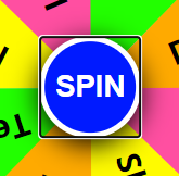
^^^ If we don’t type outline: none; then after you click, your button will have a outline box like this.
^^^ Whereas if we give outline: none; then our button will look like this (without any border) after clicking.
Now in the next block (line 9), we have font-family: Open Sans; this syntax is used to give the name of font we want to have in our block.
We changed the default display display: block (default) to display: flex. A very good reason for this is because flex enables you to align your items perfectly to the center! And that's what we have done in the next two lines.
In line 11, we marked justify-content: center;. The justify-content property aligns all your children elements to center, but vertically.
In line 12, we marked align-items: center;. The align-items property aligns all your children elements to center, but horizontally.
Next, we have the min-height property which sets a minimum height of 100vh (viewport height) to your <body>. The min-height property works together with the align-items property and helps the children to align properly at the center.
Learn more about viewport-heights.
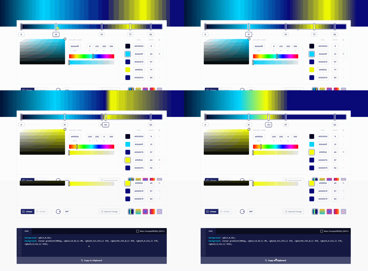
In line 15 and 16 (background section), you can use any color’s hex code or gradient. You can make your gradient on this website.
For making your gradient, simply navigate to that website and design your gradient by dragging the markers. When you are satisfied with your creation, then copy the code given below and paste it in the background section. By this, your custom background will be applied.
Now add the following code below the body block.
.mainbox{
  position: relative;
  width: 500px;
  height: 500px;
}
.mainbox:after{
  position: absolute;
  content: '';
  width: 32px;
  height: 32px;
  background: url('arrow-left.png') no-repeat;
  background-size: 32px;
  right: -30px;
  top: 50%;
  transform: translateY(-50%);
}
.box{
  width: 100%;
  height: 100%;
  position: relative;
  font-weight: bold;
  border-radius: 50%;
  border: 10px solid #fff;
  overflow: hidden;
  transition: all ease 5s;
}
Explanation:
Here first of all we have given the dimensions of the wheel in .mainbox block.
Then in the second block that is .mainbox:after, we inserted the image of the arrow (make sure to change your arrow image URL with arrow-left.png) and gave its position that will point to the random option.
Coming to the third block, here we have drawn the circle with a border of 10px and a radius of 50%. The color of the circle is #fff which is white (you can change it if you wish). On the last line is the transition property—this will be explained later during this workshop.
Now add the code below:
span{
  width: 50%;
  height: 50%;
  display: inline-block;
  position: absolute;
}
.span1{
  clip-path: polygon(0 92%, 100% 50%, 0 8%);
  background-color: #fffb00;
  top: 120px;
  left: 0;
}
.span2{
  clip-path: polygon(100% 92%, 0 50%, 100% 8%);
  background-color: #ff4fa1;
  top: 120px;
  right: 0;
}
.span3{
  clip-path: polygon(50% 0%, 8% 100%, 92% 100%);
  background-color: #ffaa00;
  bottom: 0;
  left: 120px;
}
.span4{
  clip-path: polygon(50% 100%, 92% 0, 8% 0);
  background-color: #22ff00;
  top: 0;
  left: 120px;
}
Here we have made the triangles that are present in the circle. And for making the triangles we have used polygon(value). For getting the values we have used this website. This website provides the shape and orientation of the polygon.
Just like that, we have replicated the span1 three more times then changed the name as span2, span3, and span4 respectively. We have also changed the value of color as we want different background colors and the polygon path is also changed as we are looking for different orientations each of the time.
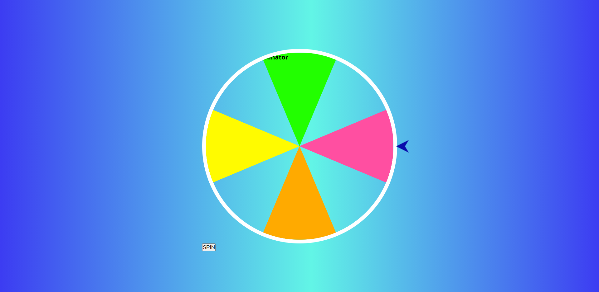
^^^ Right now our web page will be looking like this. Here triangle with yellow color is formed by span1 and just like that green, pink and orange are formed by span2, span3, and span4 respectively.
But still, we have only 4 triangles, Now to get the blank space filled, we can either create more triangles with the required orientation or we can simply rotate these 4 triangles and can fill up the spaces.
We will be rotating the triangles. So add this code:
.box1 .span3 b{
   transform: translate(-50%, -50%) rotate(-270deg);
}
.box1 .span1 b,
.box2 .span1 b{
  transform: translate(-50%, -50%) rotate(185deg);
}
.box2 .span3 b{
  transform: translate(-50%, -50%) rotate(90deg);
}
.box1 .span4 b,
.box2 .span4 b{
  transform: translate(-50%, -50%) rotate(-85deg);
}

span b{
  font-size: 24px;
  position: absolute;
  top: 50%;
  left: 50%;
  transform: translate(-50%, -50%);

}

.box2{
  width: 100%;
  height: 100%;
  transform: rotate(-135deg);
}
Here in the first 4 blocks, we have rotated the positions of our text with the required degree and in the 5 blocks, we have fixed its position inside the triangle. Then in the sixth block, we have rotated all the triangles at -135 degrees for box2 as referred to in the HTML file.
Overall now after this, we have created our half structure of the wheel.
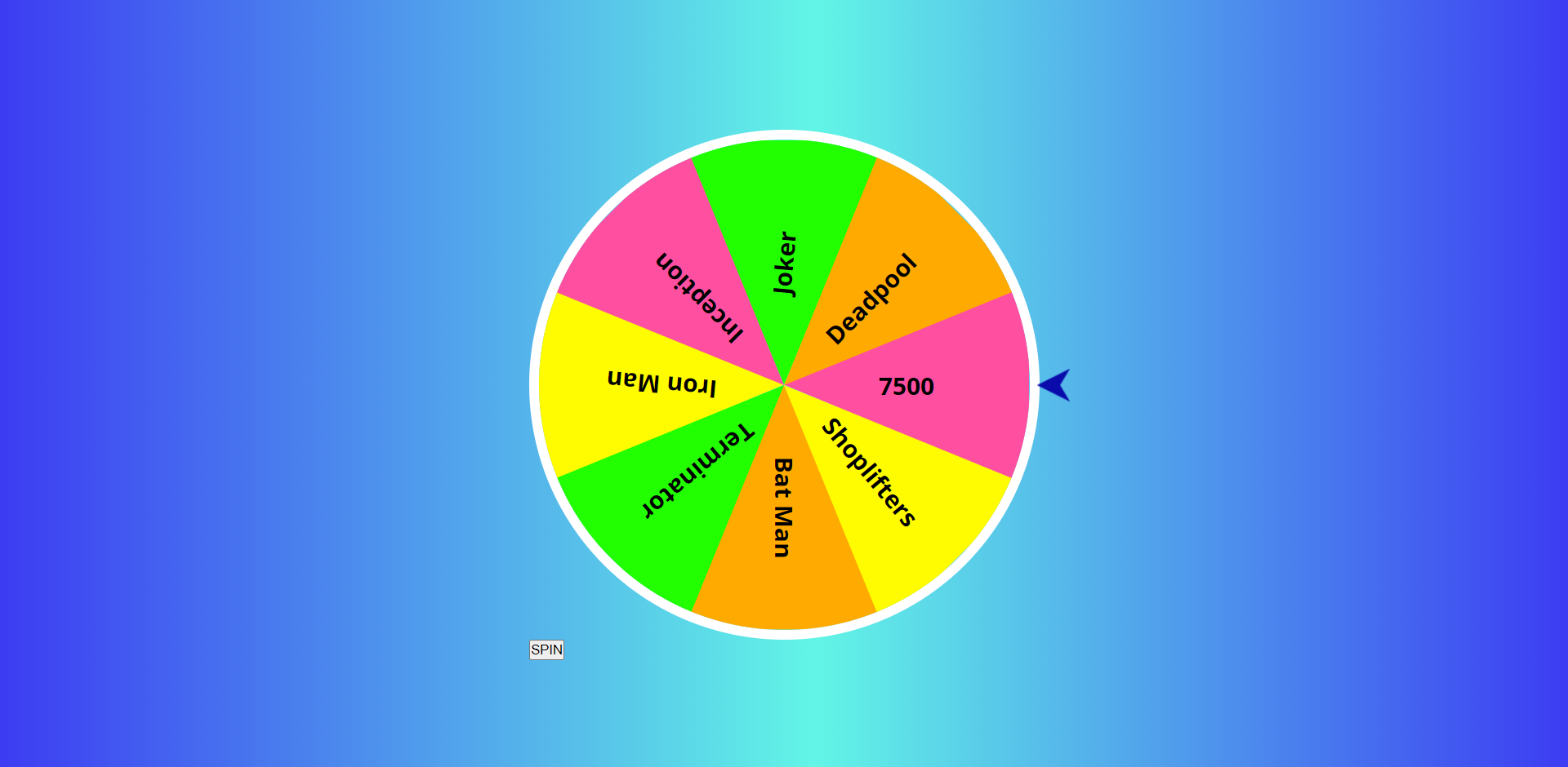
^^^ Right now your webpage will look something like this—but the spin button looks off.
Let's fix that. Add this code below:
.spin{
  position: absolute;
  top: 50%;
  left: 50%;
  transform: translate(-50%, -50%);
  width: 75px;
  height: 75px;
  border-radius: 50%;
  border: 4px solid #fff;
  background-color: #001aff;
  color: #fff;
  box-shadow: 0 5px 20px #000;
  font-weight: bold;
  font-size: 22px;
  cursor: pointer;
}
.spin:active{
  width: 70px;
  height: 70px;
  font-size: 20px;
}

.mainbox.animate:after{
  animation: animateArrow 0.7s ease infinite;
}
@keyframes animateArrow{
  50%{
    right: -40px;
  }
}
Here we have pointed our CSS selector at spin as we have given the class as spin in the HTML file for the button. We have marked its position in the center in the first 4 lines then in the next remaining lines of that block, we have formed the circle and edited its properties like height, width, border, background color, shadows, font weight, font size, and lastly in the cursor property we have given the value as pointer by which when we will hover our cursor over that button then our cursor will turn into the pointer type.
In the second block of our code that is .spin:active , we have decreased the size of the circle and font while we press our cursor over that button to give it a realistic look.
In the third block, we have .mainbox selector (we used this earlier for the left-pointing arrow), so the properties which will be edited in this will affect that arrow. Here we have applied the animation to the arrow by which it will move forward and backward every 0.7 seconds till the webpage is opened and the wheel is stopped. Well, right now it will not move.
Right now our webpage will look something like this 👇
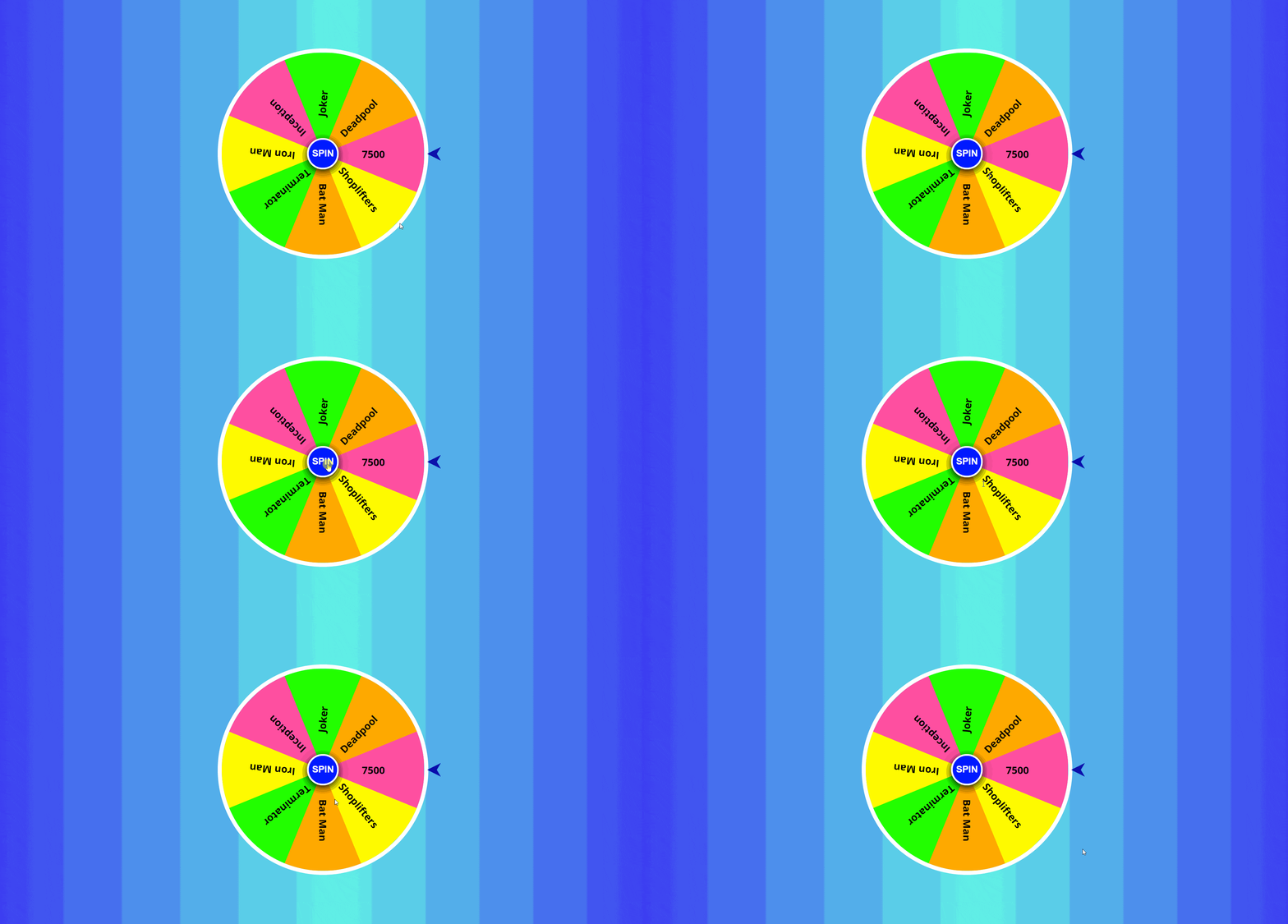
We are all done with our CSS part. But still, it is not functional as we have not added any JavaScript part yet.
What we did so far:
- We built the structure of the wheel with HTML.
- We built the display of the wheel with CSS.
Now with JavaScript, we will build the functionality of the wheel.
3) JavaScript
Jump to the script.js file and let's begin to make our wheel functional.
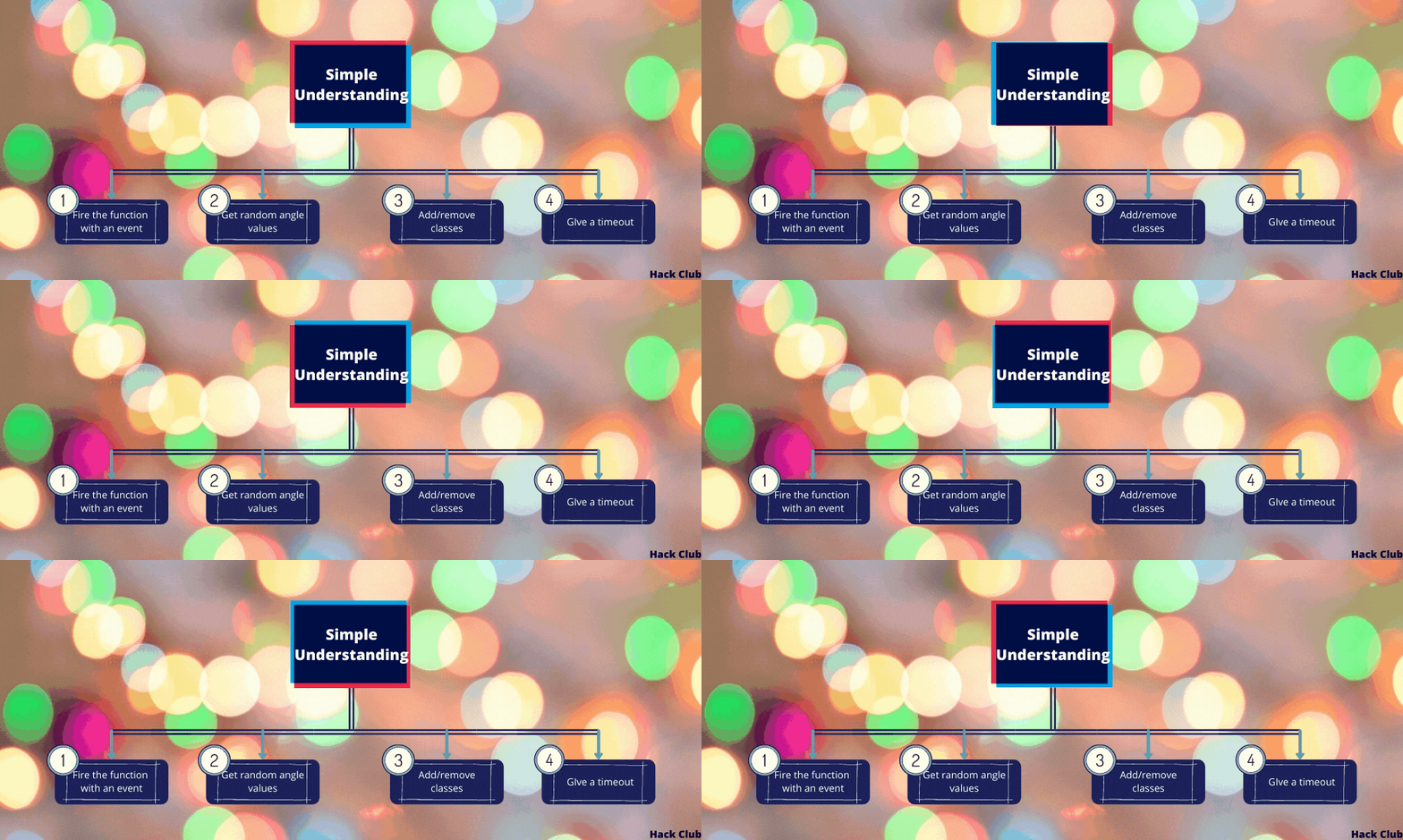
First of all, we will write:
function rotateFunction(){

}
Do you remember that I mentioned explaining the reason for putting onclick=rotateFunction() later in this tutorial while we were on the HTML file?
Now's the time to write the code for rotateFunction()!
Here above we have written the blank code for the onclick event as now we are going to nest some other code that will function when the user will click on that spin button.
Simple steps with their meaning:
- Take variable
minand give the minimum value of 1024 (var min = 1024;) - Take another variable
maxand give maximum value of 9999 (var max = 9999;) - Take next variable
degand write this code: (var deg = Math.floor(Math.random() * (y - x)) + x;). This line will generate a value between minimum and maximum. - Now find an element by element id "box" and then change its
transformstyle at the degree which we got in variabledeg.
For curious souls:
Math.random()gives a random number between 0 to 1.- Mutliplying with (
max-min) aka range will give a number between 0 to (max-min) - Stretching the range. - Adding
minwill bring the value to min to max. - Sliding the value. Math.floor()-ing the result, will give us a integer rounded off result.
Now our code will look something like this👇
function rotateFunction(){
  var min = 1024;
  var max = 9999;
  var deg = Math.floor(Math.random() * (max - min)) + min;
  document.getElementById('box').style.transform = "rotate("+deg+"deg)";
}
What we did so far:
- We designed the wheel in CSS and added
spinbutton. - We inserted the text in the columns of the wheel.
- We inserted the animation to rotate the wheel.
We have completed all the basic parts to make our project run.🥳🥳🥳
But if you wanna learn some more amazing stuff then proceed further.
Now we will make the arrow to move in its position after the wheel is stopped.
For this, inside our rotateFunction we will get the element having Id mainbox and then store it in a variable element. Then we will remove the animate class from that element. For that we will type: element.classList.remove('animate');. The classList property returns the class name(s) of an element, as a DOMTokenList object. This property is useful to add, remove, and toggle CSS classes on an element. In the next lines, we have removed the animation while the wheel is rotating.
  // Code that we wrote before...
  var element = document.getElementById('mainbox');
  element.classList.remove('animate');
Now we will add the animation to the arrow after the 5 seconds from the time when the person has clicked on the spin button. For this use this code:
  // Code that we wrote before...
  //...
  setTimeout(function(){
    element.classList.add('animate');
  }, 5000);
Explanation:
The setTimeout() method calls a function or evaluates an expression after a specified number of milliseconds. Here we have added the animation to the arrow after 5000 milliseconds. (1000 milliseconds = 1 second).
Overall as this is all inside the rotateFunction() block that we have used on the spin button. So this all will only work after we have clicked on the spin button.
Finally, we are done with our coding part in JavaScript.
Congratulations

We did it! Now our wheel is fully functional.
Part 5: Hacking
First, if you haven't created an account on repl.it yet, I highly recommend doing so! Otherwise your project will be deleted after 24 hours.
Here are some things which you can do:
- Try changing the background gradient.
- Try adding some more options to the wheel
- Try making a game that uses the wheel.
- Try by displaying the name of the option separately in which the pointer stops.
Examples of other people's projects.
Happy hacking!

